


Step One: THE SKETCH:
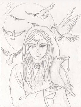 I usually think about the size of my sketch before I begin in relation to the size I want the finished piece to be. If the size really doesn't matter, I let the image and composition dictate. If it does matter, I try to sketch on something proportionate to the end result. I can always scan the sketch in and resize it for step two (transferring the sketch onto the surface). As you can probably see, I erase a lot when I sketch, but once I have it the way I'd like it, I'm ready to move on to the next step.
Step Two: THE OUTLINE:
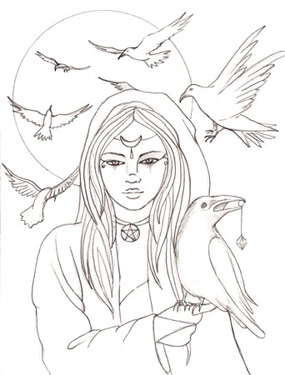
First, I tape off a margin on my surface with painter's tape. I use a multimedia artboard--they come in a variety of sizes and can be cut to size, as well. They are thicker than watercolor paper, so they're good for acrylics or even oils, but can also be used for watercolors or pastels and pencils. Next, I transfer the sketch using carbon paper. One side of the artboard has tooth and the other is smooth. I use the smooth side generally, but some may prefer the textured side. You can find them at www.cheapjoes.com. The multimedia surface is too thick for a lightbox, so carbon paper works well to transfer the image cleanly. The only drawback to the artboard is it doesn't erase very well, and it's brittle, so be careful not to drop it or chip it if you cut it.
Step Three: COLOR SCHEME:
Sometimes, the color scheme I want to use is not an issue, other times, I'm not sure which direction I'd like to take the painting. Initially, I thought this painting might have more oranges and reds, but ultimately decided against it, when I thought I might turn this painting into a witch series. While I was trying to decide on colors, however, I did some preliminary color sketches in photoshop.
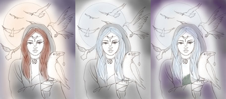
I usually never stick with exactly what I sketch in Photoshop, but it helps me decide and gives me a launch point. As you can see, my painting ended up most like #3, except I got rid of the green under her cloak in exchange for magenta and made her hair less blue and more pale blond.
Step Four: PAINTS, BRUSHES and PALETTE
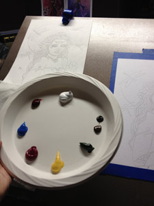
I primarily use acrylics. The consistency is usually a thinnish paste so that it flows but is not too runny. One painter I met at a conference described the ideal consistency of acrylics to that of blood. That pretty much describes it. :)
Other times, I water acrylics down to the consistency of watercolors, for underpainting and glazes. My palette is very fancy as you can see--plastic plates. Maybe not the greenest of choices, but I always find by the time I'm done with a painting, the plastic palettes from art stores have dried up paint I can't remove, and I like to start each painting with a clean palette, or clean slate, if you will. ;) Another option would be to use wax paper over something durable if you're like me and like to hold your palette.
I use mainly Golden, Liquitex Professional Heavy Body, or Utrecht Acrylics. I buy whatever is on sale usually, or sometimes there are slight variations in certain colors between brands, so it's a personal preference. I'm lucky enough to have a Utrecht store near my house, so I go there often. I LOVE their brand of brushes. They are the best brushes I've used that are affordable. I buy the synthetic bristles in varying sizes from 2-10 of flats and filberts. For detail, I love their small round brushes, sizes 0-1. They are about $2-3.00 each and keep their shape well, however, I use them so often that I buy a bunch (at least 10) most every time I shop there. I go through a lot of them!
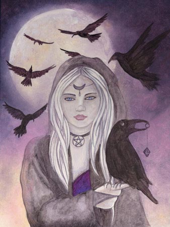
The palette pictured above is from the painting Dragon Moon in the same series. The colors I used in this painting (Raven Moon) are:
Ultramarine Blue
Alazarin Crimson
Sap Green
Naples Yellow Hue
Quidacridone Magenta
Raw Umber
Deep Violet
Titanium White
Step Five: THE BACKGROUND:
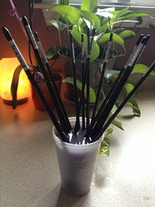
I almost always start my paintings with the background for two reasons. 1. If I get paint on the main figure(s) I can always paint over them. It's a lot easier than painting around them and looks more natural. 2. The background colors usually dictate the color of the complexion, hair and clothes of the main character. I work quickly with the paints on the background because, using acrylic, they dry quickly, and once they dry, they can't be blended. I use a lot of brushes to blend the colors so that they don't get muddy. I think I hold my breath through this process, because if you don't work fast and the colors go gray, there's not much you can do but paint over it and then the background loses a bit of luminosity and gets a chalky undertone. Below is a picture of all the brushes I typically use to paint a background. As my flat and filbert brushes begin to get old, I save them for drybrushing and blending my backgrounds. I rarely throw them out unless they get so bad from the torture I inflict on them, they're no longer usable.
The colors used for the background in Raven Moon are Ultramarine Blue, Alazarin Crimson, Quidacridone Magenta, Naples Yellow Hue, Titanium White. The color for underpainting the ravens is a mix of Ultramarine Blue, Alazarin Crimson, Sap Green and Raw Umber.
Step Six: UNDERPAINTING:
After the background is complete, the next step that makes me anxious is painting the complexion and undertones of the hair. Then, I usually go on to paint in the clothes just to get an overall idea of what the painting will look like. This could actually be two steps, but I only scanned it in after the clothing was painted, so I combined it into one step. I painted the clothes before the hair and complexion in this picture because I knew the cloak would be black and I used the same paint that I used to underpaint the ravens. I just wantered it down to paint the lighter areas.
This is usually the point where my daughter says, "Mom, you're done!" I always tell her this is when the work really begins, because even though the painting looks 90% finished, 90% of the work is in finishing up the last 10%--the details!
The colors I used for the skin tones are Naples Yellow Hue, Quidacridone Magenta, Titanium White, and what I call my purple mix (like I used for underpainting the ravens.) The mix for the ravens was heavier on the Raw Umber and Sap Green to make it look black. This mix was heavier on the Ultramarine Blue and Alazarin Crimson. I wanted her to have a pale, slightly bluish pallor, and so I also used the purple mix for the shadows, and Titanium White for highlight. Her hair is a mix of Naples Yellow Hue with Titanium White, with the purple mix for the dark areas. Her lips are Raw Umber and Alazarin Crimson.
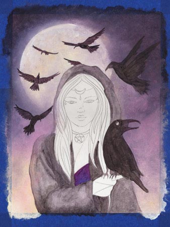
Step Seven: THE FINISHED PAINTING:
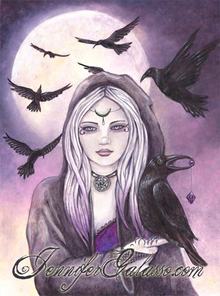
This is the step where I use a lot of purple mix, black mix and white to shadow and highlight. I layer upon layer it until I'm happy with the result, because as the paint goes on wet and looks darker, it then dries lighter, and the result isn't the same as it was initially.
I highlighted the birds in white, blending it with more of the purple/black mix I used to underpaint them. I highlighted the outer edges of the moon in white, I darkened her cloak, and I added details like lace to the top of her camisole and highlighted her necklace.
I darkened the shadows of her hair and highlighted the tips with a glaze of Deep Violet and Quidacridone Magenta and Ultramarine Blue. I added "makeup" to her eyes and highlighted and shadowed her complexion a bit more and finished her circlet and painted in the pendulum in the bird's mouth. These steps take the longest, but it's worth it to make the painting pop and to look "finished". If you notice from the original sketch, the bird behind her head is no longer holding a ball in his claws. I retracted his claws altogether because I didn't want it to look like he was going to land on her head. :)
I hope you enjoyed these steps of my painting process. Please email me if you have any questions! XO